
![]()
“Don’t Judge a Book by Its Cover” is a proverb whose simple existence proves the fact impressionable souls will do so without fail. This monthly column focuses on the film industry’s willingness to capitalize on this truth, releasing one-sheets to serve as not representations of what audiences are to expect, but as propaganda to fill seats. Oftentimes they fail miserably.
Is it officially Summer yet? Blockbuster poster campaigns for Spidey, Magneto, Godzilla, and Seth MacFarlane would lean towards yes.
Buy your popcorn and candy now because we’ve got computer generated carnage onscreen and in the lobby with possibly the most animated one-sheets without a children’s film ever (sorry Legends of Oz: Dorothy’s Return, opening May 9th, but you’re creepy looking). We’ve got Ignition trying to copy its success with The Man with the Iron Fists by using a variety of retro/vintage/graphic aesthetics for Japan’s favorite monster; BLT Communications, LLC goes electric; and some firms even go so far as using fonts other than Century Gothic. Oh, the humanity …
Superhero gallery
 |
 |
 |
 |
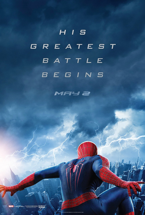
BLT knocked their teaser for The Amazing Spider-Man 2 (open May 2nd) out of the park, plain and simple.
It whets your appetite with Spidey, foreshadows the appearance of Electro through storm clouds and lightning, and doesn’t pander to its American audience by pretending we don’t know what it’s advertising. Spider-Man is there, the logo is there: we don’t need anything else. I could do without the over-zealous kerning on the tagline spacing those letters obnoxiously far from one another, but otherwise it’s great.
 |
 |
 |
 |
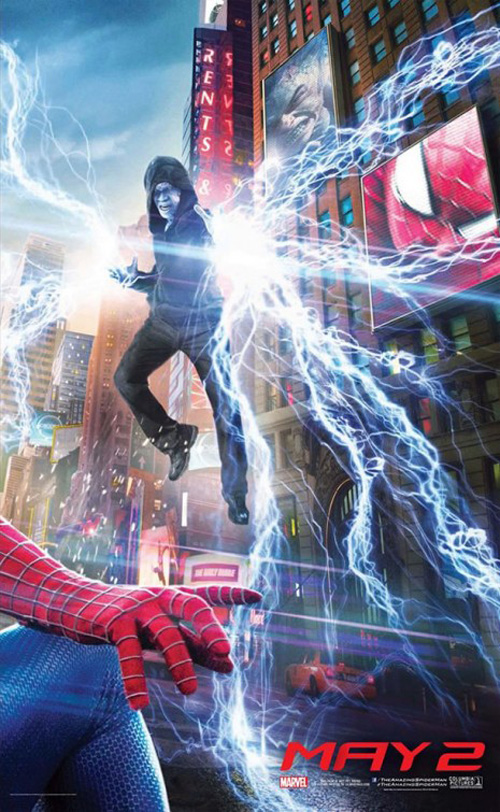
I can’t say the same for their shot of Jamie Foxx‘s Electro reflected in Spidey’s eye and not just because it’s boring. No, it’s too cartoony, there’s too much happening in such a small area, and the fact they put Green Goblin and the same image of Electro onto its large LED screens is stupid. It’s too bad too because their triptych displaying the myriad villains involved does a good job giving everyone equal weight. The screens are still present in their vomit-inducing lack of necessity, but I can accept it due to the larger scale.
The next iteration starts to go in the right direction, but still ultimately fails to reach its true potential. It focuses on Spider-Man—which I like; decides to use scene dressing to depict the bad guys (OSCORP logo at top left); and shows the kind of scale involved when a superhero flies between skyscrapers. But boy did they drop the ball flipping the image upside down. The beauty of the layout is that Spidey is suspended against gravity and yet they chose not to capitalize on it. Maybe the image in my head won’t work—and perhaps they tried it and realized it didn’t—but I’d have loved this to be turned 180 degrees.
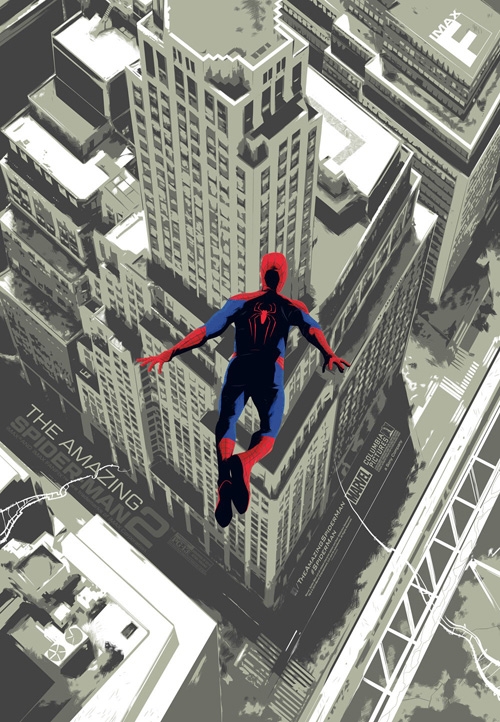
Thankfully, BLT does come through with their next version by letting computer-generated Andrew Garfield‘s head point down. The angle may be a bit wonky in comparison to the aerial view beneath him, but it at least risks having fun. Electro is still on a screen (boo), the street below is rendered in gorgeous detail (yay), and frankly it blows the IMAX limited print out of the water. I mean, seriously, who thought using the Photoshop Cutout filter would be “cool”?
 |
 |
 |
 |
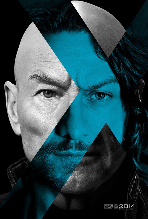
No, BLT’s work on X-Men: Days of Future Past (open May 23) wins this month’s comic book war with the help of Gravillis Inc. and their effective propaganda posters for Trask Industries.
 |
I’ll start with Gravillis’ as its Sentinel sheet is almost perfect in getting the low-fi pasted poster on a brick wall look down. It’s a bit too crisp and contemporary and could use the imprint of those bricks or wood or whatever it would be affixed upon showing through, but at least it sticks to a duotone palette with highly stylized graphics. Their second with the robot hand is a bit better if only because of the cartoony broken font on “mutants”. I like where their heads were, but even it is too modern to truly succeed.
So that leaves BLT and their past/future hybrids in ‘X’ that I admit liking a lot. They’re simple, two-color, and say nothing about X-Men besides the website at bottom. The eyes and mouths don’t match up perfectly for James McAvoy and Patrick Stewart, but the Michael Fassbender/Ian McKellan one is pretty spot-on. Blue and red make sense for good and evil and the film’s central conceit is put on display in a minimalistic and effective way.
As for their collage: I’ve seen worse. Kudos on the coloring (even though it’s more a result of Mystique’s blue than anything else) and for only using Wolverine and her as the totem of characters’ main outline. The chaos is contained by putting everyone inside those two bodies, allowing us to focus on “one” full figure against the fiery sky. Stewart’s hoverchair is the only thing that truly looks bad.
Double Check aka Spot the Difference
 |
 |
 |
 |
Remember that page in Highlights magazine? Do they still publish Highlights magazine? I should go to my nephew’s pediatrician’s office to find out …
 |
 |
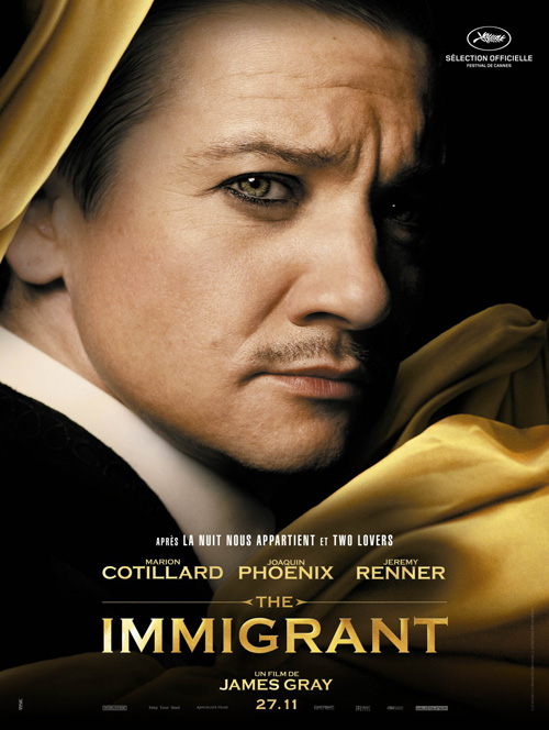 |
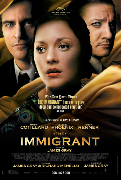
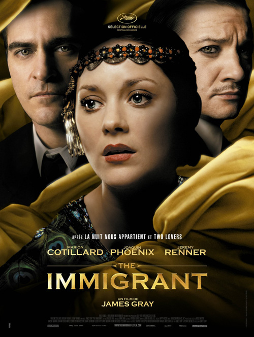
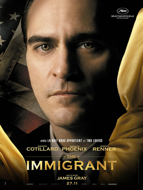
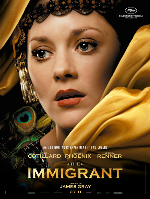
Anyway, I wonder which one of these posters came first: KINGSHOKO and RYSK‘s French-language or the almost identical English version of The Immigrant (NY/LA May 16). Neither is good—let’s get that out of the way right now. Floating faces wrapped in fabric? Badly Photoshopped faces at that? Yeah, no.
Without any redeeming qualities, however, I can’t help but zero in on Marion Cotillard‘s headband. It isn’t covering her newly airbrushed plasticity nor is it obstructing the shadowy figures behind her, so why does the American design remove it? And not only that, but why does it give the boys a nice bronze too? I guess France likes them pasty white.
 |
 |
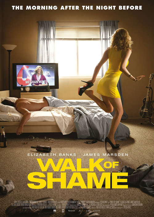
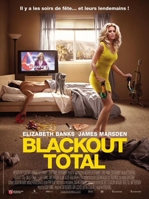
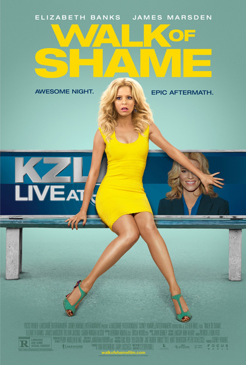
But James Gray‘s new film has nothing on Walk of Shame‘s (limited May 2) discrepancies. Now here is material for someone to write a thesis on the differences between American and French culture through pop culture movie posters. Think Jan van Eyck Renaissance symbolism for moviegoers who have no idea who Jan van Eyck is.
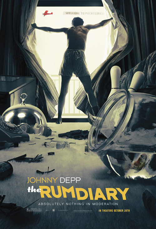
Before I get into those, though, I have to say that I kind of like WORKS ADV‘s sheet. It’s fake as all get out, but Elizabeth Banks‘ expression of shock as she covers the advertisement on the bench she’s sitting on is funny. It sets the tone for what will probably be a forgettable film delivering a few laughs. It serves its purpose.
The posters in question serve it too, though, doing what it can to mimic The Refinery‘s The Rum Diary. My question, however, is why we in America are afraid of clutter. Why? Gone is the slice of pizza, the chips, and the cat. The cat?! Hell, we aren’t even allowed to see scenery out the window. I mean I get the panties? bra? in the passed out dude’s hand being excised because sex is deemed risqué here, but why turn Banks around? Is it to make us guess whether the woman in yellow is actually the same woman on the tv? And if so, should I be happy that the US finally gets something not as easily spoon-fed as France? Cause two and two is such a tough equation to solve …
Logotype branding
 |
 |
 |
I’m going to give these next four designs some credit for trying to do nice things with text. There really are way too many movies coming out that utilize a plain sans serif, generally in all-caps. It’s effective—I get it—but at some point a little variety is welcome. These firms thankfully comply.
To start off, I don’t necessarily love InSync + BemisBalkind‘s sheet for Chef (NY/LA May 9). But it’s still light years better than Robert Downey Jr.‘s SXSW limited prints (which I still have to believe were a joke) and does its job without too much flash.
I like the warm colors, the food truck illustration at bottom, and their allowing the text to be small so as not to overpower the imagery. The window at the top is perfectly suited for a food truck opening that gives us the primary cast and everyone seems to be having fun.
At the center of it all, however, is the title in a nicely beveled serif with drop shadow to pop ever so slightly off the page and make sure we know exactly what’s being advertised. And hearty thank you for not obnoxiously slapping “The director of Iron Man” anywhere there’s space.
 |
 |
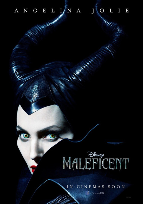
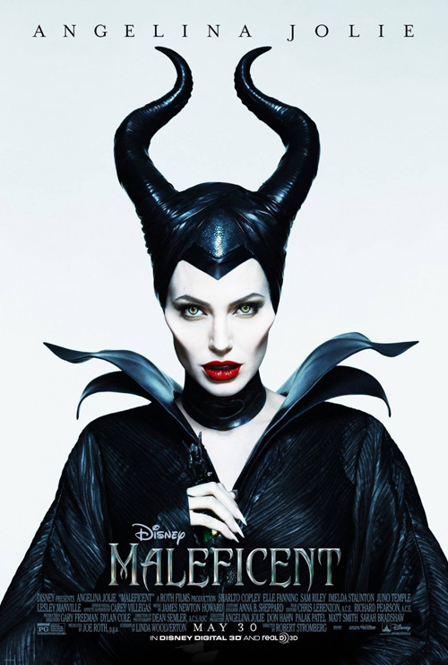
Where Maleficent (open May 30) is concerned, the praise for the font probably goes to Disney since they will most likely open the film with it. As is, I don’t know who actually did the above UK teaser—which is great in its use of black and white to catch those horns at top and Angelina Jolie‘s eyes at bottom—or the US one with Jolie from waist to head. cold open is credited with the “fairy tale” version but I guarantee all the designers received the title graphic pre-created.
Besides that, I like all three layouts on the whole. The tease does its job visually and the full Jolie showcases her villainous cheekbones. Honestly, I even like the blue one despite its cliché of putting a scene into the body of its star. Her shape provides an opened curtain to see Elle Fanning in slumber surrounded by her three fairies, the menacing eyes and vampiric mouth giving us the sense of danger that will hopefully be delivered.
 |
 |
|
 |
 |
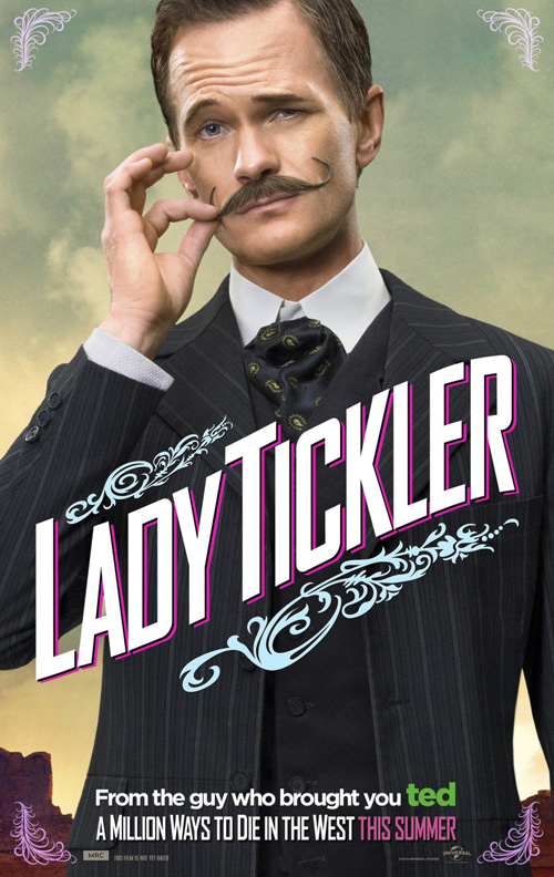 |
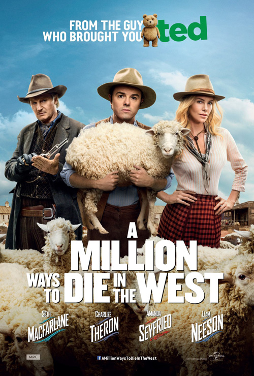
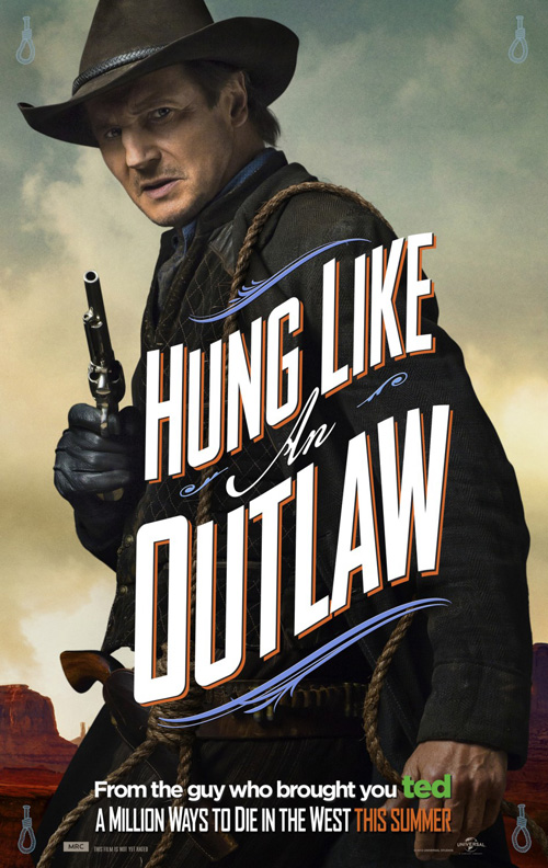
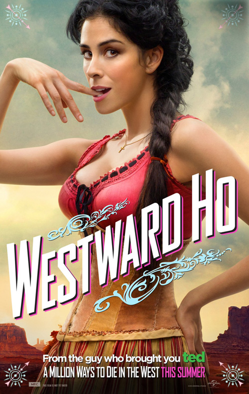
I will give BLT Communications, LLC credit for the logotype on A Million Ways to Die in the West (open May 30), though. It’s very hipster chic with a condensed, angular sans that looks like it came from the Lost Type Co-op, but it solves the problem of such a wordy name both economically and aesthetically. Paired with the floral flourishes at top and bottom, it could definitely pass for contemporary Old West.
Just compare it to the other full one-sheet where the usual thick sans is jumbled together with small text at left ruining any chance at symmetry. But the actors’ names retain the fun style beneath it? Yeah, the placement of those so close together is horrid. It’s like the names are about to be squashed.
At least the character posters kept consistent by having their taglines mimic that first teaser with the film title retaining the font at bottom too. They are simply photos with text (and weird playing card symbols in the corners) selling celebrity like all big blockbusters do, but the Dad-humor of MacFarlane shines through to at least give the surplus of versions a purpose.
The font construction I enjoy best this month, however, comes from Juan Luis Garcia and his advertisement for Stand Clear of the Closing Doors (NY May 23). It’s just plain Helvetica, but I appreciate him giving it shape. The “doors” aren’t equal in size, some words are separated between letters while others are through them, and it is somewhat clumsy, but it works.
And unlike the second version at right, his use of image complements the title with success. Its grainy, soft quality contrasts the crisp curves of the letters and the fact the title isn’t enclosed in boxes helps add movement to its “doors”. Even the distorted, fuzzy shadows beneath it assist to place the logotype into the scene rather than above it for a memorable marriage of text and photography.
Design first, product second
 |
 |
 |
 |
We’ve got art this month and I’m kind of happy about. Actors taking a backseat to style and form? That’s a rarity in this industry these days so I’m going to showcase them.
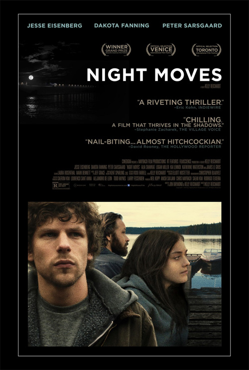 |
The Boland Design Company ignored Jesse Eisenberg, Dakota Fanning, and Peter Sarsgaard in lieu of an empty boat on their festival poster for Night Moves (limited 30). It’s all about the mood here with what is almost a monotone image besides the yellow lights in the water making us fear the worst as to why no one is rowing the vessel at center.
We can forgive the all-caps sans font because it plays with the contrast of white and gray on black, screaming at us with the first word and disappearing the second. There is intrigue here where the final sheet has none. That photo of the cast with quotes like “Almost Hitchcockian” pale in comparison to the other creating that “nail biting” feeling without any words at all.
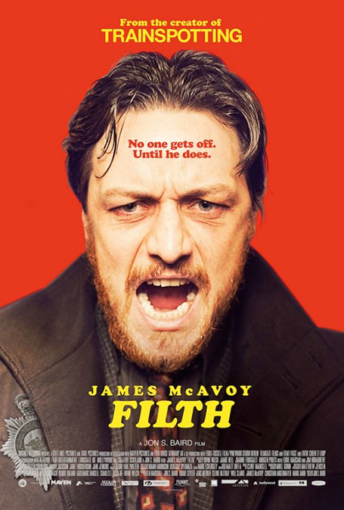 |
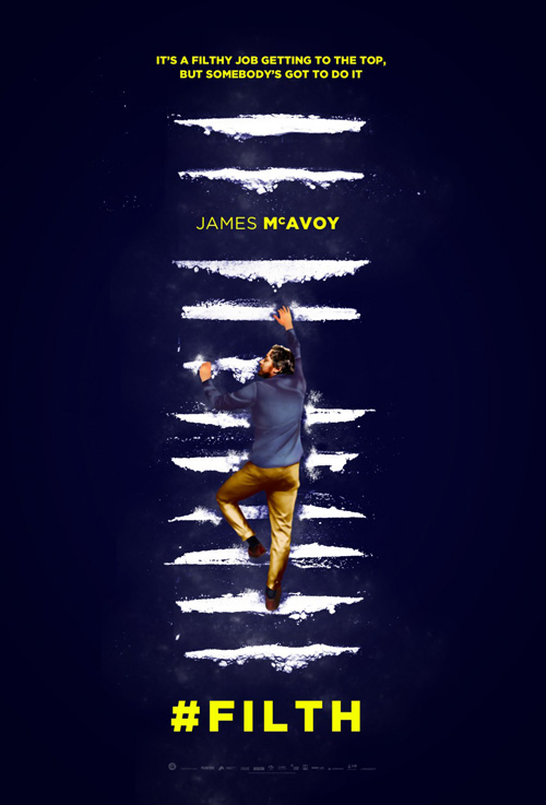
The same can be said about AllCity‘s Filth (limited May 30) and its graphic depiction of drug abuse as a never-ending ladder addicts will destroy before even getting close to its “end”. There is an otherworldly dream quality to it as you can almost make out a smile on McAvoy’s face sniffing up the rung of cocaine he’s still using to propel himself upward. And the white/yellow color palette on dark background gives it a gorgeous contrast and appeal.
Seeing his face blown-up and screaming at us in the other poster doesn’t come close to the same feeling of helplessness. I’d say okay if it somehow got to the root of the film’s humor, but his feral expression is far from epitomizing that. Stamping a lame duck joke of a tag on his forehead as well as the oppressive red doesn’t do it any favors either.
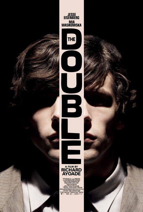 |
If you really want to see an example of a poster that gets at the heart of a film’s essence, look no further than the exquisite artwork for The Double (limited May 9). Don’t get me wrong, I enjoy the original design and its mirroring of Eisenberg’s face (an illusion that sometimes makes me think its one half flipped even though I can tell it’s his complete head split in two), but boy does this ominous vision of dystopia shine in its bleakness.
It’s exactly what you think of when conjuring images of Fyodor Dostoevsky writing or Terry Gilliam‘s Brazil (a film to which it has often been compared)—that feeling of insignificance in a world ready to consume you whole. The hand-made quality of its hatchmarks and fuzzy imperfections only make me appreciate it more as tiny Simon James stands in spotlight before walking the dry comedy of errors he must endure on his way to work.
 |
 |
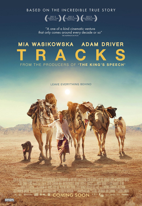
But even that one somehow seems to always take a backseat in my mind when I look at Jeremy Saunders‘ poster for Tracks (limited May 23). Its simplicity is brilliant; the expanse of sand devoid of all markings save the “tracks” left by the camels above a pristine landscape of purity. As a result we have a visual representation of the title and a metaphorical one for the tag “Leave Everything Behind”. This is an adventure where first world nonsense is finally shed at the door.
And how can you not love it exponentially more after seeing Jensen Adam Design‘s mainstream alternative with Mia Wasikowska walking towards us from a blatantly fake environment complete with laughable shadows? Or her and Adam Driver readying for a kiss with the tagline looming hugely behind them in the sky like some ominous warning? Less is most certainly more in this case and most others for that matter where poster design is concerned.
Do the monster smash
 |
 |
 |
 |
 |
 |
 |
 |
Personally I don’t get the excitement surrounding Godzilla (open May 16). I get that Monsters was good—albeit somewhat of a slog—but wasn’t everyone gung-ho about Roland Emmerich‘s reboot before it bombed hard too? And didn’t we kind of get a great Godzilla film from Cloverfield?
 |
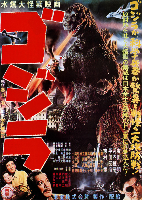 |
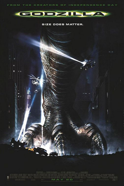
I guess if anything promising can come out of the hoopla, however, an extensive ad campaign isn’t the worst that could happen. After all, anything would be better than Vox and Associates‘ dinosaur foot back in 1998 and I like that today’s firms aren’t afraid to show the beast in its full glory. The Japanese original didn’t fear it in 1954 so why should we now?
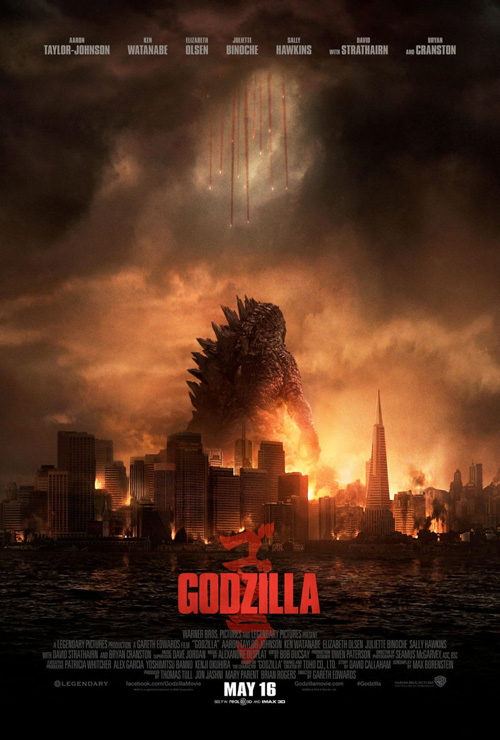
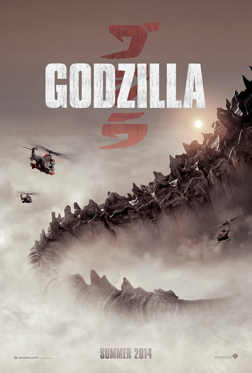
Ignition went crazy with differing aesthetics, teasing us every aspect of the film from the foggy atmosphere, the monster’s scale, and even the Japanese flag. Kudos to Warner Bros. for creating a rather effective logotype of closely kerned block letters atop the authentic calligraphy watermark because it shows this film means business. It’s not going to be all about goofy destruction—this is a serious thriller and the mood set is appropriate.
Their heavy contrast black and white is a stunning piece on its own and the red dot flag is effective despite putting the title in Godzilla’s back spikes proving a bit much. These are the posters you’d like to see up on the walls of buildings in the big city—quick and dirty iconography to seep into the recesses of your mind for future recall. Would they be as great inside the theater? Perhaps not.
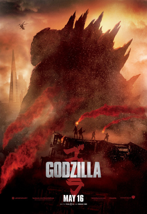
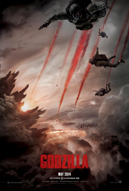
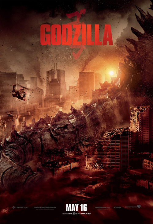
So that’s where Art Machine, A Trailer Park Company comes in with their three teasers. The first two are brilliant at giving us a sneak peek of the beast poking out through the smoke and the red trails of the paratroopers diving in. There is a severity here that I don’t think anyone would ever associated with a franchise begun with clunky stop-motion animation and men in suits. The third is a bit over-the-top, though, using the identical coiled tail as the first in a cityscape with way too much floating debris.
 |
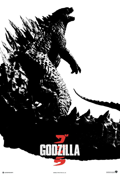
But that’s not all! Phantom City Creative swoops in with a couple high concept ideas for collectors to appreciate above Ignition’s mainstream attempts towards the same end. Their Comic Con sheet is well known by now with its concrete mass of rubble forming our titular creature and the other mimics this theme with smoky flames of carnage pluming into his shape.
It looks like everyone wants a piece of this remake—even the artists—so I better join the masses and get excited too.